Friday, 7 May 2010

Thursday, 6 May 2010
Evaluation

In what ways does your media product use, develop or challenge forms and conventions of real media products?
When we first started looking into some typical pop promos I noticed that the majority of them were very stylised and featured skilled low key lighting as well as intriguing unusual cinematography but editing transitions that weren't out of the ordinary. Promos from bands such as Massive Attack (who employed the highly regarded promo director Walter Stern) tried to be different but in a very intelligent sophisticated way. They used artificial lighting and slow motion as well as casting actual actors to star in them. Meanwhile other bands like ACDC would heavily rely on performance and the kinetic energy of a live crowd. In contrast, the Noah and the Whale promos were 'quirky' featuring very high key lighting, very colourful costumes as well as unusual cuts such as swipes and 'star shapes.' Our finished promo is meant to be a combination of style and quiet sophistication – there is a storyline that is about heartbreak which very closely follows genre conventions of other Noah and the Whale promos given that songs such as Love of an Orchestra and Blue Skies also deal with the end of a relationship. The fact that we told the story with super 8 film meant that we felt we had given it a home movie type of feel with occasionally chaotic camera work thus fulfilling our 'quirky' responsibility. It was essentially our 'something different' and helped to create a unique identity for our promo. However we decided not to fully mimic our band's style so we avoided tacky over the top edit transitions even avoiding rapid cuts, until the very end, which is somewhat of a genre convention in pop promos as directors often feel that they want to pack in as much visual flair as they can in such a short space of time. By slowing down the pace we were able to concentrate on telling a simple moving sotry showing off our mise-en-scene - keeping the costumes dark so as to portray the characters' sombre moods. I felt that we achieved a good balance between stylish and quirky heartbreak whilst creating verisimilitude by using natural lighting and believable locations. The super 8 effect is used to highlight the differences in mood between the two time scales – super 8 is playful and sunny and upbeat whilst the footage with just our main character makes use of a cold day to show his loneliness after the relationship has ended. In addition we also employed close ups of his expression to further show the audience that he is experiencing feelings of sadness in this time frame whilst also using long shots from high angles to show his sulking despondent demeanour.
Our use of locations was vital to creating the right tone – parks are usually associated with families, couples and children so these connotations made it an ideal location to set our 'happy' section. By setting some of the action in the tennis courts there was also created a playfulness to the dynamic of the relationship and the caged barren nature of the tennis courts when the character was alone helped to inflate the aura of isolation. Meanwhile, docks with the crisp cool water often create connotations, along with the bobbing ships, as feeling almost ghostly and a place of reflection (film and TV characters often go on their boats when growing tired or afraid of the rest of the world) so this equally seemed ideal to set as the location where our main character is in mourning. Despite this though we were able to show a happier side to the location, with our female character, by using the excelling number of restaurants and the almost idealic nature of the boats creating an exotic feel. The boats are a passage to anywhere.
 to set our 'happy' section. By setting some of the action in the tennis courts there was also created a playfulness to the dynamic of the relationship and the caged barren nature of the tennis courts when the character was alone helped to inflate the aura of isolation. Meanwhile, docks with the crisp cool water often create connotations, along with the bobbing ships, as feeling almost ghostly and a place of reflection (film and TV characters often go on their boats when growing tired or afraid of the rest of the world) so this equally seemed ideal to set as the location where our main character is in mourning. Despite this though we were able to show a happier side to the location, with our female character, by using the excelling number of restaurants and the almost idealic nature of the boats creating an exotic feel. The boats are a passage to anywhere.
 How effective is the combination of your main product and ancillary texts?
In the end, for our package and print advert, we decided on a still image from our film as the motif. We considered using an animated image as it would have tied in with the band's indie image but couldn't come up with an idea particularly original or appealing. I thought that the image of the two characters together would look heart warming but on reflection our use of natural light, which worked well in the film, simply made the image look rather naive and amateurish. In the package as a whole we tried to play more on the 'happy' side of the relationship as we thought this would play better to the market and to the band's image. We showed them as effectively a mirror image, with the two shot, showing that they were ideally suited to each other. In addition the youthful age of the characters would hopefully appeal to the target market for this package which is teenagers and people in their twenties. We hoped that by showcasing the super 8 effect on our inside cover we could further demonstrate its uniqueness and stand out to consumers as an attribute unseen in most other pop promos and DIGI Packs. We were also careful to use very similar type faces and fonts in both texts to continue our links and not to confuse the audience by disaligning the products. In our research there were bands such as Muse whose pop promos differed rather in tone from their album covers (they had a dark rebeelious promo but a kaleidoscopic cover) but we decided to go more along the lines of artists such as Mika whose package contained almost complete visual symmetry. An advantage of a difference is the opportunity to appeal to a wider demographic but given that our preliminary research showed our promo to be aimed at a generally specific audience this argument was unsatisfactory to us. Finally, our ideology of the package is simple 'love' and that people are on the whole happier together than alone.

What have you learned from your audience feedback?
Judging from our research into our band's core audience it was obvious that the key demographic for this promo were teenagers and young adults with an interest in offbeat music and film (The Squid and the Whale, Eagle vs Shark etc.) so it was important to make a promo not in the style of a big profile band (like JLS or Girls Aloud) with lots of dissolve cuts to close ups of good looking people or costumes designed to be revealing and 'sexy.' This audience would also be fairly middle class with a decent amount of money to spend on DIGI Packs. On showing our promo to an audience that fulfilled some of those criteria there was a generally positive response. They told us that the narrative was easy to follow and they agreed with our choice of locations for the reasons I mentioned earlier. They particularly liked the super 8 footage as they believed it added a new dynamic and highlighted the sunniness of the characters at that time whilst also praising the fluidity of the camera during these sections with further approval of the authenticity created by the 'home movie' tone which was further enhanced by a strong performance by our female actress. There were of course complaints – they thought that the yellow titles up top looked cheap and tacky and not in keeping with the tone of the promo but simply an unnecessary distraction. They also would have liked to have had more close ups of the main character in mourning in order to showcase better the grief he was feeling, they also said that one shot (where we used a manual focus) wasn't executed very well with one suggestion being that we should have 'rolled' our finger down the manual focus button rather than twiddling which only caused a rather jumpy effect instead of the slow move into the mid shot we desired. Also, there was an element of confusion about the ending where I as editor used an effect to make the girl look ghostly thus producing ambiguity as to whether the girl had died or if the couple had just broken up. Ideally we wanted to create the feeling that either way the girl had become 'dead' to our male character for one reason or another. One brief negative point was the thought that that last shot should have used the super 8 effect because as it was absent, confusion was caused in terms of knowing at what point in the timeline that shot occured. But really the biggest complaint was the simple fact that the band wasn't in the promo – there was an argument that how could the film be promoting the band if they aren't even in it? This was a problem we knew we would face from the beginning so it came as no real surprise.
Moving on, there was unfortunately a bad response to our DIGI Pack. They agreed that the front cover (the still image) looked cheap looking as if the image had been stretched out of it's correct dimensions and that the three images lacked an overall concept. It was as if they were from different albums. The feeling towards the print advert was the same – it just didn't stand out and I myself have to agree that as a group we weren't clear enough on producing an eye catching motif or truly showing off the band's image of 'do it yourself art' and a breakaway from mainstream music.

How did you use media technologies in the construction and research, planning and evaluation stages?
To finish, it is important to note that we carried out most of our research on the internet using YouTube to view and then analyse pop promos from both our own band and others in order to better get a grip of the market. Fan forums and the way Google easily allowed us access to them was also key in working out the messages and values of the band and their fans. Blogger served as a quick and easy way to keep an online diary of our progress as it allowed us to write succinctly whilst also being easy to upload vital images and videos to help explain our thought processes meaning it was probably the most important technology. It was only rivalled by the abilities of FinalCutPro to really create our super 8 film effect which was vital in our tone. There was a lot of experiment on the programme under the 'bad film' and 'colour corrector' and it was only the time we were allowed on the programme that enabled our eventual success. Of course, the DV cameras hugely helped our filming capabilities given their easiness to transport from one location to another as well as their sturdy nature on a tripod to allowing us to add fluidity and realism to the camerawork when filming the flashbacks. Finally, Photoshop helped us to create our inside covers but looking back, we perhaps should have used it to create our front cover as well as it may have led to a more original indie set of artwork. It was alos my first time on Photoshop and given that I was chief editor, I didn't get a lot of time to perfect my skills so I feel guilty over having not contributed sufficiently to this aspect of the coursework which I think has been established as our weakest area. Chris managed to use software on his home laptop to create really interesting offbeat images which have better suited our album cover.
Friday, 30 April 2010
Thursday, 29 April 2010
Print Advert

We decided that our print advert should be based around our album cover, so as you can see this is the case. Whilst the image is the same, enabling consumer cohesion, there is additional information pertaining to the date as well as adding a couple of fictional quotes from national newspapers to give the product 'status' and respect from a large potential market.
Furthermore, we have kept the same red typeface as the DigiPack cover and this continues the constant image and helps to market each section of this project into the same market. Hopefully a consumer will recognise the DigiPack cover from this advert given the semantic imagery.
Final DIGI Pack Design

.jpg)
As a class we agreed the DigiPak/CD Covers should contain:
Band, Song and Record Label logos
Titles - Band, song/album name
Track listing
Copyright Protection logos and information (©, ®, ™)
Barcode & Price
DVD details - age certification or 'Parental Advisory: Explicit Content' label
Pictures - front, back, middle (inside and outside)
4-Sided with 2 Spines- 2 pics outside (front/back covers), possibly 2 inside
6-Sided with 3 Spines- 3 pics outside (front, middle, back covers), 2 inside, with Production pics or a "Production & Artwork" booklet
Collector items
Competition entry forms
Limited Edition - 'Exclusive DVD included', 'Bonus tracks', or 'uncut version'.
Band, Song and Record Label logos
Titles - Band, song/album name
Track listing
Copyright Protection logos and information (©, ®, ™)
Barcode & Price
DVD details - age certification or 'Parental Advisory: Explicit Content' label
Pictures - front, back, middle (inside and outside)
4-Sided with 2 Spines- 2 pics outside (front/back covers), possibly 2 inside
6-Sided with 3 Spines- 3 pics outside (front, middle, back covers), 2 inside, with Production pics or a "Production & Artwork" booklet
Collector items
Competition entry forms
Limited Edition - 'Exclusive DVD included', 'Bonus tracks', or 'uncut version'.
I believe we have included all of these in our cover: we have a list of the tracks to the background of our favourite shot - a rising sun, the front cover of the couple in 'motion' with identical imagery to our print advert and finally an example of our super 8 film footage to showcase this technique to a potential audience. We also put a faded image of a duck behind the actual disk just for 'kitch' value.
Tuesday, 16 March 2010
Next Editing Session
After receiving feedback from our tutor I decided to swap some of the shots around thus differing our narrative slightly. In the original version we first introduced the female character in flashback and then jumped forward to our main protagonist sulking in grief, however we now introduce him first and the girl at around 1 minute. I believe that this allows the audience to understand the storyline more effectively as they can see the despondency of the main character and know that he has lost his 'love.' As well as that I was concerned about our allegro instrumental sections due to the fact that at first we simply had shots of the characters observing ducks in the pond. Therefore I moved the 'duck' shots to take place as part of the scene setting and had the instrumental sections contain Emily running (to demonstrate the upbeat music).
Also I decided that the opening forty seconds felt a touch slow so I experimented with the addition of 'titles' and found that this worked fairly well and the band had also used titles in some of their own pop promos. Most importantly I added the super-8mm film effects by using in built functions on Final Cut Pro including 'bad film' and 'colour balance' to all the shots where the 'girl' was in shot.
Also I decided that the opening forty seconds felt a touch slow so I experimented with the addition of 'titles' and found that this worked fairly well and the band had also used titles in some of their own pop promos. Most importantly I added the super-8mm film effects by using in built functions on Final Cut Pro including 'bad film' and 'colour balance' to all the shots where the 'girl' was in shot.
Other group DIGI Pack Ideas
This is Emily's design for a cartoon based DIGI Pack which would in many ways reflect the offbeat quirky nature of the band as well as standing out from most other covers you find in the market. The downside would be that it may a look a bit childish which could alienate our young adult demographic.


 These two designs were created by Chris using his home laptop. As you can see they experiment with different fonts as well as seeing debating whether a mid two shot is better than two separate close ups.


 These two designs were created by Chris using his home laptop. As you can see they experiment with different fonts as well as seeing debating whether a mid two shot is better than two separate close ups.
This simple design was a communal effort and despite the image being quite plain it is an image we think sums up the story line of our pop promo very well. Although more details will have to be included on the final front cover.
These final two designs were created by hand by Vhris and then scanned onto blogger. They are my favourite images but I beleive that they would need some fine tuning and organisation in order to allow them to be the final covers.


Friday, 8 January 2010
Individual DIGI PACK Ideas


I am the first to admit that I am rubbish at art and I realise that my efforts at fonts look kitch to be polite and nasty to be honest. I think however that my still shots could used somewhere, if only on the inside cover, as they aere well lit and create interestingly shaped pathways and contours which could be used as a metaphor for the passage of time our pop promo will go through.
Editing
Over the course of two lessons I logged all of the footage we collected from our three filming sessions in order to begin to cut it together. Following that I cut together the shots to form our desired narrative. I quickly realised that some of our shots lasted too long (7 or 8 seconds) and that they were not in keeping with the traditional quick paced cuts of pop promos. However we didn't want to lose great swathes of the footage we liked so I broke up the longer takes into two or even three sections and placed other shots, as well as dissolve cuts in some cases, into them. I was mostly pleased with the results as we got as it enabled us to see our main character's physical journey and therefore his enveloping sadness over loss of his partner.
Mostly I employed conventional edits in order to establish a narrative based video but when we switched either timeframes or locations I decided that it would be appropriate to use more unothodox edits that were often symbol based as this drew the attention of the audience so that they were fully aware of the change. I also decided to use our extensive footage of animal life in the instrumental chorus as these were our shots with the highest degree of quick movements but after several views I have become unconvinced by this and am considering putting in recaps of the couple's exploits instead and using the animal footage more as way of establishing location during the less allegro like section of both verses. I think it's important now to cut rapidly between both time frames during the chorus in order to show the stark contrast of the main character's feelings from one period to the next.
After studying our first edit I am fairly pleased with the footage of our main character looking despondent as well as most of the shots showing the couple's jovial times. However I am still slightly concerned by how we are linking them together and making best use of the juxtapositional nature of our video, i.e the upbeat song with the end of a relationship. It is alos important to note that as of yet we have not finalised the method which we will use to make the flashbacks look like Super 8mm film footage which I believe will be vital in establishing contrast.
The following log was created by Chris Kenworthy and I have modified the personal pronouns to refer to myself.
Log, Capture and First Edit
Today we managed to sort out the problem we had last Friday with logging and capturing our footage. There was one minor hiccup, where we started to record instead of playback our footage, but we only lost a couple of seconds of footage which wasn't that important anyway.
After logging and capturing the footage, I started to piece together all the shots in a timeline in Final Cut Pro, whilst Chris continued his research into the aged-film "Super 8mm" Film Effect using both the internet and Final Cut Pro to experiment with different effects. Emily, meanwhile, continued to develop her own individual ideas for the Digipack (CD Cover) and Poster.

Chris exported the first edit from Final Cut Pro into a ".mov" file. The cuts and transitions are not yet perfect, as this is like a first draft of the project so far. Therefore, don't expect to see perfection. He then uploaded the file to his YouTube Channel, and will soon upload it here once he has compressed the file to a smaller size.
The photographs above are screenshots Chris made of the handheld shot which rotates 360 degrees in a circle - we used this shot in our editing.
Research into the Super 8mm Effect for use with Final Cut Pro
Although Chris is not Chief Editor, and I am, he might be working in cooperation with me as the Co-Editor. Therefore he has kindly devoted himself into finding some research into the "Super 8mm" Effect we had discussed about in Group Production Meetings and agreed to use if possible for the flashback elements of our Music Promotional Video for "5 Years Time" by Noah and the Whale. He found the information below on: http://forums.creativecow.net/thread/8/918311, when someone had posted on this forum "Can anyone suggest the best way to emulate a super 8 or an aged film look in final cut pro?":
There are many plug-ins (Nattress is one) that simulate the effect. But if you want something cheap and free. Export the clip out of FCP using "Quicktime Conversion" Then, under Option-Filter-Special Effects, you can add some a film hair/dirt effect that's not too bad. Combine that with color correction in FCP and possibly some speed adjustment (Old 8mm always seems sped-up a bit) it might just work for free. Ernie Santella Santella Film/Video Productions
http://www.santellaproductions.com/.
Chris also found the following useful information on this website:
http://www.nattress.com/Solutions/solutions.htm#6:
I want to make my video look like film: The Film Effects package was designed for you! Whether you are using PAL, NTSC, or HDV (or HD or SD) Film Effects has settings which will make your video look much more filmic. Film Effects does 25p conversion for PAL frame rates and 24p conversion (with 3:2 pulldown added) for NTSC frame rates. It has over 20 presets and you can make your own. There are over 27 plugins, all designed for different aspects of making your video look filmic and can be used in combinations or separately. Film Effects also gives you immense control over the gamma and tone of your image, so it can be a great tool even when you're not trying to make your video look like film.
I want to make my video look like old Super-8 film: Film Effects has a preset called "Old Projector". This might be exactly what you're looking for, or you can use it as a starting point.
Chris found the following useful advice on: http://library.creativecow.net/articles/smith_stephen/film_look.php (ALL CREDIT TO THIS WEBSITE AND THANKS FOR THE ADVICE!! WE WILL CONSIDER THESE IDEAS AND HOPEFULLY THE RESULT WILL BE AS PLANNED!!)
1. Black & White or Sepia
Black & White
Select the desired clip in the time line.
Choose Effects > Video Filters > Color Correction > Color Corrector 3-Way.
Double click on your clip and then select the Color Corrector 3-way tab in the viewer. Drag the Sat (Saturation) slider tab to the far left.
Drag the Whites slider to the right and the Blacks slider to the left slightly, this will add more contrast to your clip and make it feel more dimensional.
Sepia
Select the desired clip in the time line.
Choose Effects > Video Filters > Image Control > Sepia.
Double click on your clip and then select the Filters tab in the viewer.
Change the highlight amount to give the clip a more realistic sepia color. I find 33 works well for a lot of clips but it does vary.
Click on the triangle in the Tint Color box and then adjust the S slider to give your clip a more faded look. I find 58 works well in a lot of situations.
2. Export Clip
This is where you get to add all of the visual effects that are associated with old or damaged film.
Mark in and out points on the timeline of the clip or clips you wish to give that old film look to.
Choose File > Export > Using Quick Time Conversion.
Give the clip a name, locate where you would like to place it and select what format would work best.
Click the Options button. In the video settings section select the Filter button.
Click on the triangle next to the text Special Effects. Then select Film Noise.
Click on the Hairs button and change it to Scratches. Set Scratch Density to 0.
Adjust the Dust and Film Fading > Film Fading setting to None.
Change the Hairs settings and the Dust and Film Fading settings to your liking. I adjusted the Hairs > Hair Density to 48, while I bumped the Hair > Hair Length to 47.
Click Ok and then click Ok again in the Movie Settings box. Then click on the Save button.
When the clip is done exporting your in and out points remain on the timeline. Repeat steps A through D and then change the Scratches > Scratch Density from zero to around 6. Don’t worry about the scratches looking fake, that will be remedied in the next section.
Click Ok and then click Ok again in the Movie Settings box. Then click on the Save button.
3. Double Clips up
This section will take the edge off of the fake looking scratches.
Import the two clips and drag them into the timeline.
Place the clip with the scratches on top of the clip with out.
Drop the opacity of the top clip to about 30 percent.
4. Ad Flicker
This step adds that extra touch of believability to that old film look.
In the Viewer click on the A in the film strip.
In the drop down menu drag the mouse to the word Matte. Then click on the word Color from the menu that pops out of the side.
In the Viewer select the Controls tab and then click on the gray box.
Change the color to black and hit OK.
Select the Video tab and then drag the matte to the track above your two clips in the Timeline.
Click on the Clip Overlays button on the Timeline and lower the clips’ opacity to 17.
Select the pen tool from the Tool Pallet.
Add a keyframe to every four frames of the matte. Then drag every other keyframe to zero opacity.
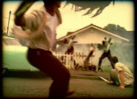
Mostly I employed conventional edits in order to establish a narrative based video but when we switched either timeframes or locations I decided that it would be appropriate to use more unothodox edits that were often symbol based as this drew the attention of the audience so that they were fully aware of the change. I also decided to use our extensive footage of animal life in the instrumental chorus as these were our shots with the highest degree of quick movements but after several views I have become unconvinced by this and am considering putting in recaps of the couple's exploits instead and using the animal footage more as way of establishing location during the less allegro like section of both verses. I think it's important now to cut rapidly between both time frames during the chorus in order to show the stark contrast of the main character's feelings from one period to the next.
After studying our first edit I am fairly pleased with the footage of our main character looking despondent as well as most of the shots showing the couple's jovial times. However I am still slightly concerned by how we are linking them together and making best use of the juxtapositional nature of our video, i.e the upbeat song with the end of a relationship. It is alos important to note that as of yet we have not finalised the method which we will use to make the flashbacks look like Super 8mm film footage which I believe will be vital in establishing contrast.
The following log was created by Chris Kenworthy and I have modified the personal pronouns to refer to myself.
Log, Capture and First Edit
Today we managed to sort out the problem we had last Friday with logging and capturing our footage. There was one minor hiccup, where we started to record instead of playback our footage, but we only lost a couple of seconds of footage which wasn't that important anyway.


After logging and capturing the footage, I started to piece together all the shots in a timeline in Final Cut Pro, whilst Chris continued his research into the aged-film "Super 8mm" Film Effect using both the internet and Final Cut Pro to experiment with different effects. Emily, meanwhile, continued to develop her own individual ideas for the Digipack (CD Cover) and Poster.


Chris exported the first edit from Final Cut Pro into a ".mov" file. The cuts and transitions are not yet perfect, as this is like a first draft of the project so far. Therefore, don't expect to see perfection. He then uploaded the file to his
YouTube Channel, and will soon upload it here once he has compressed the file to a smaller size.The photographs above are screenshots Chris made of the handheld shot which rotates 360 degrees in a circle - we used this shot in our editing.

Research into the Super 8mm Effect for use with Final Cut Pro
Although Chris is not Chief Editor, and I am, he might be working in cooperation with me as the Co-Editor. Therefore he has kindly devoted himself into finding some research into the "Super 8mm" Effect we had discussed about in Group Production Meetings and agreed to use if possible for the flashback elements of our Music Promotional Video for "5 Years Time" by Noah and the Whale. He found the information below on: http://forums.creativecow.net/thread/8/918311, when someone had posted on this forum "Can anyone suggest the best way to emulate a super 8 or an aged film look in final cut pro?":
There are many plug-ins (Nattress is one) that simulate the effect. But if you want something cheap and free. Export the clip out of FCP using "Quicktime Conversion" Then, under Option-Filter-Special Effects, you can add some a film hair/dirt effect that's not too bad. Combine that with color correction in FCP and possibly some speed adjustment (Old 8mm always seems sped-up a bit) it might just work for free. Ernie Santella Santella Film/Video Productions
http://www.santellaproductions.com/.
Chris also found the following useful information on this website:
http://www.nattress.com/Solutions/solutions.htm#6:
I want to make my video look like film: The Film Effects package was designed for you! Whether you are using PAL, NTSC, or HDV (or HD or SD) Film Effects has settings which will make your video look much more filmic. Film Effects does 25p conversion for PAL frame rates and 24p conversion (with 3:2 pulldown added) for NTSC frame rates. It has over 20 presets and you can make your own. There are over 27 plugins, all designed for different aspects of making your video look filmic and can be used in combinations or separately. Film Effects also gives you immense control over the gamma and tone of your image, so it can be a great tool even when you're not trying to make your video look like film.
I want to make my video look like old Super-8 film: Film Effects has a preset called "Old Projector". This might be exactly what you're looking for, or you can use it as a starting point.
Chris found the following useful advice on: http://library.creativecow.net/articles/smith_stephen/film_look.php (ALL CREDIT TO THIS WEBSITE AND THANKS FOR THE ADVICE!! WE WILL CONSIDER THESE IDEAS AND HOPEFULLY THE RESULT WILL BE AS PLANNED!!)
1. Black & White or Sepia
Black & White
Select the desired clip in the time line.
Choose Effects > Video Filters > Color Correction > Color Corrector 3-Way.
Double click on your clip and then select the Color Corrector 3-way tab in the viewer. Drag the Sat (Saturation) slider tab to the far left.
Drag the Whites slider to the right and the Blacks slider to the left slightly, this will add more contrast to your clip and make it feel more dimensional.
Sepia
Select the desired clip in the time line.
Choose Effects > Video Filters > Image Control > Sepia.
Double click on your clip and then select the Filters tab in the viewer.
Change the highlight amount to give the clip a more realistic sepia color. I find 33 works well for a lot of clips but it does vary.
Click on the triangle in the Tint Color box and then adjust the S slider to give your clip a more faded look. I find 58 works well in a lot of situations.
2. Export Clip
This is where you get to add all of the visual effects that are associated with old or damaged film.
Mark in and out points on the timeline of the clip or clips you wish to give that old film look to.
Choose File > Export > Using Quick Time Conversion.
Give the clip a name, locate where you would like to place it and select what format would work best.
Click the Options button. In the video settings section select the Filter button.
Click on the triangle next to the text Special Effects. Then select Film Noise.
Click on the Hairs button and change it to Scratches. Set Scratch Density to 0.
Adjust the Dust and Film Fading > Film Fading setting to None.
Change the Hairs settings and the Dust and Film Fading settings to your liking. I adjusted the Hairs > Hair Density to 48, while I bumped the Hair > Hair Length to 47.
Click Ok and then click Ok again in the Movie Settings box. Then click on the Save button.
When the clip is done exporting your in and out points remain on the timeline. Repeat steps A through D and then change the Scratches > Scratch Density from zero to around 6. Don’t worry about the scratches looking fake, that will be remedied in the next section.
Click Ok and then click Ok again in the Movie Settings box. Then click on the Save button.
3. Double Clips up
This section will take the edge off of the fake looking scratches.
Import the two clips and drag them into the timeline.
Place the clip with the scratches on top of the clip with out.
Drop the opacity of the top clip to about 30 percent.
4. Ad Flicker
This step adds that extra touch of believability to that old film look.
In the Viewer click on the A in the film strip.
In the drop down menu drag the mouse to the word Matte. Then click on the word Color from the menu that pops out of the side.
In the Viewer select the Controls tab and then click on the gray box.
Change the color to black and hit OK.
Select the Video tab and then drag the matte to the track above your two clips in the Timeline.
Click on the Clip Overlays button on the Timeline and lower the clips’ opacity to 17.
Select the pen tool from the Tool Pallet.
Add a keyframe to every four frames of the matte. Then drag every other keyframe to zero opacity.
Filming

In the last week of the Christmas term we filmed in two locations, Christchurch Park and the Ipswich Waterfront. We gathered all of the shots we were scheduled to get on those days but unfortunately on the friday when we were due to complete our filming heavy snow and staff absence prevented us from doing so. However we are endeavouring to work out an afternoon or two when we complete our filming. For the time being further heavy snowfall has made filming in our locations impossible so we are for the moment spending our time updating our blog and beginning to log, capture and edit our existing footage.

During the filming we have managed to execute we have been keen to produce a variety of camera shots and angles which serve to add both texture and characterisation to our video. For example we have played around with focus in some of our shots so that our main character (Chris K) is at first out of focus and then comes into it as the camera comes across him. We hope that this technique will produce the effect of portraying the character as someone who is not quite in tune with the world because he is in mourning. As well as that we have used several tracking and panning shots to show the character's journey, moreover his meandering struggle with his own existence.
Disruption
After this successful shoot we were forced to wait until after the Christmas break to complete our filming, however there then followed several weeks of snow and bitter weather rendering our filming capability obselete. As a result we were forced to fit our filming into the first available friday morning but this meant that our 'actress' Emily Halls was unable to film so our own group member Emily Swager kindly consented to play the 'girl.' We shot for around ninety minutes at Christchurch Park, filming her 'playing up to the camera' as if the main protagonist was holding it and deliberately making the camerawork slightly shaky and amateurish knowing that we would be adding effects to make the footage look like old super-8mm film. We also filmed some shots with both Chris and Emily in frame so as to provide a link between them in terms of relationship for the audience.
Additionally we went on to film by Ipswich Waterfront, employing many of the same handheld techniques as we 'followed' Emily along the quay side. We filmed here for around ninety minutes again and were satisfied that we had garnered all of the footage we needed.

Thursday, 10 December 2009
I asked a questionnaire to seven students in my class, who are aged between 17 to 19 and I asked the following questions:
1.Have you ever heard of Noah and The Whale?
2.What type of music do you like to listen to?
3.Which do you like better a pop promo with a Narrative or performance?
4.Do you like music with Lyrics or without Lyrics?
5.Would you watch the pop promo of a song even if you didn’t like the song?
From the first question the results were interesting as a lot of people have heard of Noah and the Whale, out of the seven six people have heard of them. This is good in a way because it means that these students have an idea of what type of genre Noah and the whale play, but at the same time it’s bad as these students can compare our pop promo with the original pop promo’s of Noah and the Whale.

There were a various different types of genre for music, but the main types of genres were: Metal, Rock, R&B, Hip Hop, Pop, Trance, and Classical. A lot of these students prefer many different types of genres rather than sticking to one type. There is a joint top of genre of music, which is: Metal, Rock, RnB, and Hip-Hop, pop. This is bad for our group as the genre of music that Noah and the Whale like to perform is indie type music, which the students have not even included in their favorite types of music.
Our group asked this number three because for our pop promo it is just a narrative and we are interested in what people are more interested in performance or narrative. The result of this question came out equal (five each) which is interesting because a lot of the students chosen both. But this is good for our group, as we now know that it is not that important to have any performance and no one will be disappointed.
Our group asked the question four because some people in our class are actually doing a pop
promo without any lyrics and our group were wondering what these group of students actually prefer to listen to. This questions goes with what type of music people like to listen to all of those genre’s of music that they choose have lyrics in them normally apart from trance. This is good for our group as we have lyrics in ours also lyrics are good for a pop promo as it gives a narrative which we can follow rather than a pop promo without lyrics because then the pop promo has to go to the beat of the music rather than the lyrics.
The last question we asked because we want to know if any would actually be interested in looking up Noah and the Whale but the results of this showed that people prefer to watch a pop promo if they like the song, people who don’t mind watching a pop promo if they didn’t like the song only said that they would watch the pop promo for research. I think that this is a true point as if you like a song a lot most people want to see how the band have managed to create it on screen.
From our research of this questionnaire I can say that our group is on the right path of knowing how to capture this audience, but at the same time are really down side is that no one in our class enjoys indie, which might put our fellow students off our pop promo.
1.Have you ever heard of Noah and The Whale?
2.What type of music do you like to listen to?
3.Which do you like better a pop promo with a Narrative or performance?
4.Do you like music with Lyrics or without Lyrics?
5.Would you watch the pop promo of a song even if you didn’t like the song?
From the first question the results were interesting as a lot of people have heard of Noah and the Whale, out of the seven six people have heard of them. This is good in a way because it means that these students have an idea of what type of genre Noah and the whale play, but at the same time it’s bad as these students can compare our pop promo with the original pop promo’s of Noah and the Whale.
There were a various different types of genre for music, but the main types of genres were: Metal, Rock, R&B, Hip Hop, Pop, Trance, and Classical. A lot of these students prefer many different types of genres rather than sticking to one type. There is a joint top of genre of music, which is: Metal, Rock, RnB, and Hip-Hop, pop. This is bad for our group as the genre of music that Noah and the Whale like to perform is indie type music, which the students have not even included in their favorite types of music.
Our group asked this number three because for our pop promo it is just a narrative and we are interested in what people are more interested in performance or narrative. The result of this question came out equal (five each) which is interesting because a lot of the students chosen both. But this is good for our group, as we now know that it is not that important to have any performance and no one will be disappointed.
Our group asked the question four because some people in our class are actually doing a pop
promo without any lyrics and our group were wondering what these group of students actually prefer to listen to. This questions goes with what type of music people like to listen to all of those genre’s of music that they choose have lyrics in them normally apart from trance. This is good for our group as we have lyrics in ours also lyrics are good for a pop promo as it gives a narrative which we can follow rather than a pop promo without lyrics because then the pop promo has to go to the beat of the music rather than the lyrics.
The last question we asked because we want to know if any would actually be interested in looking up Noah and the Whale but the results of this showed that people prefer to watch a pop promo if they like the song, people who don’t mind watching a pop promo if they didn’t like the song only said that they would watch the pop promo for research. I think that this is a true point as if you like a song a lot most people want to see how the band have managed to create it on screen.
From our research of this questionnaire I can say that our group is on the right path of knowing how to capture this audience, but at the same time are really down side is that no one in our class enjoys indie, which might put our fellow students off our pop promo.
Friday, 4 December 2009
Bands similar to Noah and the Whale
 Mumford and Sons
Mumford and Sons are a folk/blugrass band who have received positive critical acclaim from national newspapers such as the Guardian who featured them on their 'Band of the Day' online forum. They originated in London's pub folk scene (Twickenham in fact which is where Noah and the Whale originated) and have garnered a strong cult following amongst this crowd. In fact two of their band members even when to the same school as Noah and the Whale's bass player.
They released their debut album Lend Me Your Eyes in July 2008 and its lead single Roll Away Your Stone was featured as Radio 2's single of the week. They are attached to the label Chess Club which released their second album in November. In addition they made a successful appearance at the Cambridge Folk Festival where they wooed audiences with their country-tinged acoustic anthems mainly featuring banjos and double bass. The band pride themselves on their lyrical sensibilities about love, loss and despair. They also dabble in socio-political messages which is a nod to the decades of work by Bob Dylan. Finally, the band features as one of its singers, Laura Marling who has sung with Noah and the Whale.
They finished a nationwide tour in 2008 with support from Peggy Sue, Pete Roe, The Cutaway and more. They are now touring with the Maccabees and have been longlisted for the BBCs Sound of 2009. As well as that they have received airtime and support from Radio 1 DJs Zane Lowe and Greg James as well as XFMs Dave Berry. Mumford & Sons won Best Band at the 3rd Annual BalconyTV Music Video Awards in Dublin on 3 July 2009. In addition they now have a specially designated playlist folder On Virgin TV On Demand along with the likes of the Rolling Stones and Lady Gaga which goes to the show that they have broken into mainstream culture.
Some of their songs include:
Little Lion Man
Winter Winds
White Blank Page
Feel The Tide
The Cave
Primary Research
After finalising our idea we were required to pitch our ideas to the rest of our A Level group by telling them a brief version of the synopsis and treatment as well as playing them our song. It seemed that most of the group were not great fans of the song as it was "too happy and upbeat" which suggests that this section of our age group prefers a darker and more sombre melody to a typical Noah and the Whale tune. They did however express positive feedback for our narrative which involves the end of a relationship possibly because of the death of the girl involved. Although some of the group did express slight concerns that the song was not appropiate for the story and that the melancholic undertones would be subdued by the 'jolly' nature of the song but we countered this by saying that we are aiming for a 'bittersweet' tone which highlights the contrast between the good times and the bad in the relationship hence showing clearly the tragedy of these snippets of a broken heart. Our tutor meanwhile indicated support for our idea and was passionate about the themes we were looking to explore. Finally one problem we may have is that as we are using an established band our audience may already have prejudices which could dissuade them from liking our pop promo which would not be a problem for other groups who are using local bands that they know personally who are unknown to the vast majority of people.
Friday, 27 November 2009
Rundown of Lyrics

At the docks by himself sitting down looking at his legs looks sad-first 38secs
Oh well in five years time we could be walking round a zoo – high angle in park establishing to point of view in docks, walking around happy.
With the sun shining down over me and you
And there’ll be love in the bodies of the elephants too
And I’ll put my hands over your eyes, but you’ll peep through
Rapids cuts in-between music between time frames
And there’ll be sun sun sun –them happy in the docks
All over our bodies
And sun sun sun - switching back to him walking alone at the docks
All down our necks
And sun sun sun-happy couple

All over our faces
And sun sun sun- him alone
So what the heck
Cos I’ll be laughing at all your silly little jokes- This is set in the park playing tennis
And we’ll be laughing about how we used to smoke
All those stupid little cigarettes
And drink stupid wine
Cos it’s what we needed to have a good time
And it was fun fun fun
When we were drinking – them happy playing tennis ball bounces then cuts to him alone
It was fun fun fun
When we were drunk - him staring into the tennis court
And it was fun fun fun
When we were laughing -ball bounces back to them laughing playing tennis
It was fun fun fun
Oh it was fun – then him staring into tennis courts but we shoot him through the gate.
Oh well I look at you and say – Them playing hide and seek near the tree him hiding behind the tree
It’s the happiest that I’ve ever been
And I’ll say I no longer feel I have to be James Dean
And she’ll say – Them running down hill happy
Yah well I feel all pretty happy too
And I’m always pretty happy when I’m just kicking back with you
And it’ll be – Them happy playing still running up hill
Love love love
All through our bodies – cuts when he goes behind tree and turns around and cuts to him alone near the tree
And love love love
All through our minds – happy
And it be Love love love
All over her face - sad
And Love love love
All over mine - sad
Although maybe all these moments are just in my head – him lying in the road remembering times
I’ll be thinking ‘bout them as I’m lying in bed
And all that I believe might never really come true – she walks across but like a ghost and he sees her but she just vanishes
And all that I believe might never really come true – she walks across but like a ghost and he sees her but she just vanishes
But in my mind I’m havin’ a pretty good time with you
Oh
Five years time – Them in the road and they are fighting
I might not know you
Five years time
We might not speak
Oh
In five years time
In five years time
We might not get along
In five years time
You might just prove me wrong – you see her just vanish.
Oh there’ll be love love love – during this time is the different places that they were together (Christchurch, docks and the road) of them just being happy
Wherever you go
There’ll be love love love
Wherever you go
There’ll be love love love
Wherever you go
There’ll be love love love- by this bit you see him near the tree in Christchurch and him alone
Wherever you go
There’ll be love love love
Wherever you go
There’ll be love love love
Wherever you go
There’ll be love love love – this bit he scatteres ashes and we get a still shot (?) of the ashes coming out of the jar.
group Synopsis and Treatment
Synopsis

 New paragraph, middle (where the tree is) – Girl- Normal clothing, but different clothing from the beginning of the pop promo (jeans, shirt and thin jacket) Man- Normal clothing (jeans and top and thin coat). Whenever he is alone he is wearing the same clothing of the jeans top and jacket.
 New paragraph, middle – No props required here apart from the tree which will already be in Christchurch Park.
Song: "5 Years Time" by Noah and the Whale
This pop promo will be about a man remembering good times with his girlfriend. It involves two time scales, one when the couple are both happy together and the other when the relationship is over. This section will have a more melancholic tone. We will then reveal that his girlfriend is actually dead and he has been remembering some of their last moments together, some of which will be of them arguing. The video is about the man overcoming his grief.
We start at the docks for our first location with a high angle shot of the sun. At first we focus on the man wandering about aimlessly by the water’s edge and then sitting down and dangling his legs over the edge. We then cut to the two of them in the same location but at a different time after the man sees her reflection in the water. They seem happy and contented. During the chorus we cut rapidly between the two time periods to highlight the contrast of feelings.
For the next location we will be at Christchurch Park and we will witness the man making his way through a wooded area with the looming trees adding a hint of gloom in the promo’s tone. He will emerge and find himself looking on at an empty tennis court. We will then cut to the two of them playing in the tennis court beginning to have a slight disagreement. The girl will hit a ball away in anger and it will be picked up by the man in the next time scale. During the chorus we will once again cut rapidly between the time scales highlighting the contrast.
During the final section we will see the man lying on an empty road alone. We will then cut to the other time narrative to view the couple having a big argument which culminates in her walking away. Our final shot is of the man lying hopelessly in the road and then the girl appears above him but when he blinks she disappears.
Treatment
Editing:
Our narrative consists of two time scales so it will be important to make it clear which scale we are in by possibly using visually arresting cuts such as swipe edits when we switch time scales. Apart from those moments I intend to stick mostly to conventional edits although I may employ a couple of jump cuts during the argument to create an atmosphere of chaotic friction. I may also use a couple of graphic matches during the rapid cuts of the choruses in order to show the breaking symmetry of the periods.

In addition we have also discussed using a super 8 type of visual colour for the flashbacks as it creates a sense of hyper reality as well as harking back to a time in the past. It will also hopefully further distinguish between the different time scales keeping the audience abreast of what is happening in order to avoid confusion. It is also important to point out that editing can play a more significant role in this project than in our film noir project as cuts are often more obvious, numerous and stylised in pop promos. It will also be vitally important to integrate all of our establishing shots to highlight our changing locations as they play a vital role in showing the characters' relationship, i.e the waterfront is when they are calm and relatively happy (the smooth elegance of the boats and water) whereas the park with its wintery and wooded almost gothic atmosphere is better suited for the slightly souring nature of their relationship. Also the tennis court, a place of rivalry and competition, is ideal to show the first glimpses of conflict in their relationship.
Costumes
Beginning of the pop promo – Girl – Normal clothing (jeans, shirt) Man- Normal clothing (jeans, top)… when he is by himself he can be wearing a different top and jeans and a jacket (he can have his hands in the pocket jackets to make him look more sad)
New paragraph, middle – Girl – Wearing sporty clothing (tracksuit) Man – Wearing sporty clothing as well (tracksuit). Whenever man is alone he is wearing the same Jeans and jackets and he normally has his hands in his pockets to make it look like it is colder weather and he is sad.
 New paragraph, middle (where the tree is) – Girl- Normal clothing, but different clothing from the beginning of the pop promo (jeans, shirt and thin jacket) Man- Normal clothing (jeans and top and thin coat). Whenever he is alone he is wearing the same clothing of the jeans top and jacket.
End – Girl – Normal clothing (jeans, top and a thicker coat) to show that it is getting colder. Man – Normal clothing (jeans, top and a thick coat).
Whenever the two of them are together their costumes should be lighter, for instance they can be wearing white or brighter colors like blue, to try and resemble summer. And as time goes by they wear darker clothing for instance the man could start with a normal blue shirt then when it goes further down the song it goes to a navy blue colour,
Whenever the man is by himself he can be wearing neutral colors, so a neutral jacket co lour like muddy grass green, and his shirt can be a black same with his jeans, to try and show he is mourning.
Props
Beginning of the pop promo – A bench (when the man is alone) but the bench will already be at the docks.
New paragraph, middle – We need two tennis rackets and at least 3 tennis balls in case we loose any.
 New paragraph, middle – No props required here apart from the tree which will already be in Christchurch Park.
End – We need a jar that looks like an urn, also we need ashes, which we will get from Josh’s fireplace.
Lighting
Whenever the two are together it will be natural light to make it seem happier.
And whenever the man is by himself we should try and use low-key lighting to make things moodier or we can add more shade to make it look darker.
Cinematography
For the synopsis, we have collaborated our ideas and the Treatment has been delegated to each member of our group, and I agreed to create the Storyboards and therefore the Treatment for the Cinematography of the video. This was going to be the Group Treatment, a collaboration of the Treatments for different areas that will be covered during this project.
For this task to be completed accurately I took into consideration various rules, codes and conventions used by professionals and expert cameramen in the media, when filming with any type of video camera system. These include the “Rule of Thirds”, the “180 degree line rule”, the “30 degree line rule”, “Handles”, “Match-On-Action” (continuity and flow of one shot into another), and “Framing”.
The “180 degree line rule” will apply greatly to the continuity and comfortability of the video from the audience’s point of view. If the man walks from the right to the left of the screen and the girl from the left to the right of the screen, in shots to follow this known movement should be retained, unless otherwise shown by the camera, where the camera tracks from one side to the other. Then, once you have explained how the two characters have been moving and how we as an audience have ‘crossed’ that ‘line’, as a cameraman you can then begin to develop shots with a different point of view of the characters. Otherwise, a bad mistake and confusion can often lead to audiences becoming less interested in your production and your mishap is considered to be a moviemaking error and a bad piece of camerawork.
For the first shot, the establishing shot, we had discussed a possible point-of-view shot of the Sun. This is personification of the Sun because we are seeing what the Sun sees, if it had a point of view of our world. So, I took this as a consideration, and as a result I have decided that the first shot could either be a High Angle Shot from the Sun’s point-of-view, or indeed a Low Angle Shot of the Sun, then from the Low Angle the camera tilts down to look at the street, but at the same time elevating the tripod using the Elevate/Depress tripod controls, so that when the street does come into view we see the street as if it is from the Sun’s point-of-view, or that of a CCTV camera (as in the CCTV camera joke video above), but looking to the right of the street.
The second shot is a continuation of the first, so Match-On-Action is increasingly important here. We see the man walking, “wandering aimlessly by the water’s edge” as Josh had put in our Synopsis. I was thinking of maybe a High Angle Shot looking down to the left of the street, the camera on the opposite side of the street this time, and focusing on the man as he walks from the right to the left of the screen, continuing his movements from the first, establishing shot. I was hoping that to cut down on the number of shots we actually use, we could make these two opening shots into one long one, so that we are not worried about the flow of the cuts, but if we do film and edit these as two shots then we must pay particular attention to the “180 degree line rule” and the continuity and flow of the transition between the two shots.
The third shot is of the man as he sits down by the water’s edge and dangles his legs over the edge of the promenade, his legs dangling above the water. We could have a Wide Shot of him as he walks to where he will sit down, the camera panning left to give him some “looking space” in the framing of the shot when he sits down. As he has approached and sat down next to the camera, the shot changes from a Wide Shot to a Medium Shot. Originally I thought we could have only the man in focus (Shallow Focus) then when he crouches to sit down we re-focus the shot so that both the foreground and the background are in focus.
When he sits down, the next shot is of his legs dangled over the edge and his reflection in the water below. Because I wanted to show his legs at the bottom of the frame, I think this shot will be better shot as a handheld shot, and have a focus pull from his legs to his reflection, ready for the next shot of the water where we see him and his girlfriend reflected in the water. She isn’t really there, and the reflection of her is just one of his memories which sets us up for the shot to follow.
To be creative, I thought the next shot of the water could be in the past, still with their reflections in the water, only this time it is a memory, not so much an illusion. I thought we could have the shot of his legs and her legs dangling over the edge, only they are both in different clothing to his present - in summer clothes, and as they get up and leave happily from the spot at which they were sitting, in the next shot (a Long Shot), hand-in-hand, the real man in the present time still sits there, and sees his memory as if he is a ghost in another world, invisible to others but not to us, watching as their relationship together (in his past) progresses to the video’s climax. I reckon we can add this effect to the video in Editing, and only involves superimposing, or overlaying one shot onto another.
We had discussed, as a group and with our lecturer Jon, that we could use the effect on our video called “Super 8mm” which was an old type of camera. I researched this on various websites, and found a video on YouTube which was the best example I could find of this video effect. It comprises handheld footage with the style of watching a reel of negatives produced from, for example, a family holiday in the 1960s, viewed in the 21st Century. We agreed that if we could in fact create this kind of effect for our video on our Editing software Final Cut Pro (on the Apple Macintosh computers in our Editing suite), as the camera equipment we are using records onto Mini-DV Tapes, then we would use this effect to our advantage on shots where we see the man’s flashbacks and memories on-screen.
Concluding on the fact that our narrative is about a man who now has a sad life, remembering (through the use of flashbacks) the good times he had with his girlfriend, I thought of using mostly Wide Shots or Medium Shots, with a couple of Dutch Tilts here and there where appropriate and maybe a couple of Extreme Close-ups on their hands joined in his flashback. I want to include a shot where we are focused on a metal fence (in the tennis courts?) with them arguing in the background but out of focus, then pulling off a Focus-Pull so that when she leaves him after their argument (in the tennis courts?), we focus on him, alone, and possibly crying (or not).
Friday, 20 November 2009
Development of ideas
After playing around with several songs from the likes of David Bowie, Johnny Cash and Basement Jaxx we decided on 5 Years Time by Noah and the Whale. We decided on them because they were still relatively unknown and didn't have as fixed a reputation as the other artists we considered. This was important to us as we felt that it would give us more creative license that wouldn't be hampered by audience prejudices.
Furthermore after discussing story lines we came to the conclusion that the promo will feature two characters, a man and woman. Chris has agreed to play the man, following his highly acclaimed performance in our film noir project, whilst the girl will be played by our mutual friend Emily Halls. As an added point we have decided to film the scenes involving both characters from the point of view of the man in a similar style to the channel 4 sitcom Peep Show.
I should also mention that we briefly considered changing the song to another Noah and the Whale single, Blue Skies. The idea came about as we were talking about introducing more melancholic themes into the promo such as the death of the girl and the following grief of the man. I felt that Blue Skies was a more sombre tune than our original song and that therefore it may suit our story line better. However after further deliberation within the group we decided to stick with our original song and aim for the juxtaposition of the upbeat rhythm with the growing feeling of sadness in the mood of the story.
Research into band's marketing and promotions

Noah and the Whale are a British indie folk band. This is the cover for their second album The First Days of Spring which is also a film written and driected by lead singer Charlie Fink. He said in an interview on Radio Fivelive with Simon Mayo and Mark Kermode that he wanted to produce an album in a different way to other artists and this seemed an ideal way given his love of films (the band's name is taken from the film The Squid and the Whale). For the album the group were interviewed by many major media outlets such as Radio 1 and leading newspapers such as the Times which furthered their reputation.


Included on that Album was the single 5 Years Time which was marketed as the 'Summer Single of the year.' It received many positive reviews from publications such as NME, the Guardian and even the BBC News website which all suggested that it was the tune everyone was whistling that summer. The band became a success almost overnight.

Many publicity shots of the band, such as this one, play on their image as alternative to pop culture but not in a rebellious way like a rock band like Kasabian or Green Day might do but rather a slightly quircky even possibly quaint band. Most of their songs are about love and relationships and they cite their lyrical poetry to artists such as Bob Dylan however the band has yet to divulge into more socio-political agendas like Dylan did (civil rights being his biggest message).
They have made relatively few television appearances concentrating more on live gigs and have played gigs in place like Bristol, London, Leeds, Reading and Manchester as well as performing at the V festival and Glastonbury.

The band started out on the London pub scene and up until last year included vocalist Laura Marling in their lineup. They slowly built up a good reputation around London which culminated in them being signed on to Cherrytree Records and Vertigo in order to record their debut album, Peaceful the World Lays Me Down.

Target Audience and Fan Base (Star Construction)
As you can see the band deliberately portray themselves as slightly offbeat and quirky and still have a relatively small fan base. However this small fan base is very positive about the band, for example their is much enthusiasm for the announcement of new singles and tour dates on blogs such as Absolute Radio, Amazon and of course the band's official blog:
noahandthewhale.forums.umusic.co.uk which also includes entries from the band themselves often commenting on how their tours are progressing or if they are recording any new material.
I would suggest that the target audience for the group is a relatively small group of people who have an existing passion for indie and folk music and are part of a community of friends that does. They will probably also have a general interest in music of an alternative genre to that usually in the UK Charts which is usually dominated by Pop, Metal and Rap. The band however has discussed in interviews about moving towards a more punk rock sound which could possibly alienate some factions of their fan base.
A major factor in the band's image is how they dress, they appear to deliberately dress in an alternative fashion disregarding many modern conventions and they employ bright colours and scarves highlighting their quirky side.
Analyses of other pop promos by our band

Blue Skies by Noah and the Whale (Director Charlie Fink, 2009)
The single Blue Skies is taken off the band's second album, The First Days of Spring. It is essentially a trailer for the band's film that is partnered with the album. The pop promo begins in the style of a film with credits showing the production companies and we then move to a continuing two shot of two bearded men having a conversation about when was the last time the man, pictured above, had fun. There is only dialogue during this section and the song only begins to play after about 30 seconds. There is then the reveal of the title of the film and album in a font that resembles handwriting which suggests that the film is intending to be quite elegant.
Following this the lyrics kick in talking about broken hearts and we see super 8 film footage of a woman playing by a tree which indicates that the song is going to be about broken romances. There is then the introduction of several storylines via cross cutting with heavy use of slow motion in order to emphasise the movements of the characters which involve, the two previous characters riding their bikes, an old man on a porch swing and a man carrying the urn containing the ashes of what we assume was somebody close to him. I believe that the locations of each character are also important. For example, the two men going on a bike ride switch from mid shots in street pathways into the open countryside suggesting that they are looking for an escape from the town. Interestingly, at one point there is a cut from a long shot to a mid shot which implies that the man is becoming more important as he goes on his journey.
There is then a conventional edit to the man carrying the urn as the instrumental chorus kicks in and there is further cross cutting across the various storylines all of them in slow motion which may also be to suggest that the people are existing in a kind of hyper reality. After the chorus there is the juxtapositioning of locations, the forset for the urn carrying man and the beach for the two men. The forest is shot in mostly wide shots with subtle camera movements in order to establish it as an elegant and maybe even slightly mythical aesthetic location which ties in with the theme of grief. In contrast the beach uses panning shots to show the full breadth and apparent emptiness of the location and there is then a two shot from behind the two men which shows that they are cut off from the rest of the world. The beach is a sanctuary after personal difficulty. There is also the close up of one of the man wandering towards the sea which may be intertextuality to the Robert Altman film The Long Goodbye.
Finally there is the section of music featuring heavy use of trumpets which create an atmosphere of triumph and this coupled with the long shot of a red car, being driven by the man who deposited the ashes, indicates that this particular character is moving on with his life.
 Love of an Orchestra by Noah and the Whale (Director: Charlie Fink,2009)
The pop promo begins with sketchy super 8 film footage of the same girl that appeared in Blue Skies who once again looks happy and contented in the location of the forest. In the background soft barely audible orchestral sounds are heard on the beginning of the track which helps create an atmosphere of tranquility. We then dissolve cut to a man in what I estimate may be his mid sixties. The last remnants of the super 8 film footage plays out on the projector screen behind him giving the impression that the footage was his memories coming back to him.
It is also important to note that there are no cuts for almost the rest of the promo. Indeed there is just a mid shot of him sitting at a desk which contains a glass and bottle of alcohol which indicates that he has been drinking which may have been the catalyst in the recollection of his memories and for his later actions. More orchestral music begins (heavy use of violins and cellos) and it conjunction the man begins to put on a white tie. As he does this the camera gradually begins to move in closer and we see an expression of what can be described as liberation. These factors contribute to suggest that the man is reaching an important point of self realisisation in his life.
Finally the orchestral music climaxes and the beat of a brass instrument we see the first cut in nearly 90 seconds to a close up of the man. Lyrics of a choir like orientation are heard and instanstaneously we see the man miming the lyrics which is done in a comedic fashion. After he has done this the desk parts in two via some sort of mechachnised joint and he moves onto a stage illuminated by low key lighting and he is seen making conductor movements whilst the first lyrics by the band's lead singer are heard. They talk about never being lonely because, "I've got the love of an orchestra." These lyrics tie in with the theme of the album which is that taking comfort in other aspects of your life in order to move on from other personal grievances. During this section of the video the man dances exuberantly defying his age and sending out a message that he has received a new lease of life.
There is one final cut that which is that to a close up of the back of his head almost in silhouette as he is walking away. His ears seem unusually bright compared to his surroundings and this may be a representation that his ears are powerful conduits for music which creates intense energy in his being.

Shape of My Heart by Noah and the Whale (Director: Charlie Fink, 2008)
The pop promo is a homage to the horror and sci-fi movies made from the 50s to 80s by Mexican wrestler El Santo as the band are fans of this type of alternative cinema. It is shot with what appears to be super 8 film making the promo look homemade and therefore more intamate with little desire for vain self-publication and the location is on a deserted beach which is very windy and seemingly cold. These conditions immediately create a feeling of isolation and possibly sadness because of their negative connatations. After a couple of establishing shots we have close ups of each member of the band via the camera panning across from left to right.
For the first minute only two members of the band are shown with musical instruments with the rest holding sound recording equipment and appearing to be making a film within the pop promo. There is also a zoom out from a little hollow on the beach to reveal the band and this technique may have been used in order to showcase the appearance of the band on the beach and giving them an almost mythical quality. Simultaneously bright yellow text appears at the bottom of the screen saying things such as 'Boom Recording' which ties in with the idea of the band making their own film within the pop promo. Also during the slower portion of the first verse the camera slowly moves to follow the violinist but then cuts directly at the point when the melody jumps to a more up tempo chorus as wee the rest of the band skinny dipping.
We then see a close up of a brightly coloured kite and we then cut to an over the shoulder shot in order to show the kite begin to fly. This shot is very close to a point of view shot and it helps to show the audience the height from the beach at which the kite was flying. There then follows a montage of all of the band playing their instruments as the kite scatters around the sky and it gives the effect that the flight path of the kite is directly influencing the rythm of the song.
During the final section we cut to another location which appears to be a house in the middle of a seaside town and in it is a single individual who has a sound receiver and picks up the recordings made by the band. This runs concurrently with the high tempo music at this point which is heavily driven by the use of trumpets. The man arranges the sounds in what seems to be his bedroom which has the mise-en-scene of a classic science fiction film because of its low key yet multi coloured lighting and the various gadgets attached to the main computer which gives it the look of a technological hub of activity. The final shot is of the band on the computer monitor which signals that they have achieved their ambition of creating a film out there on the beach.
Tuesday, 10 November 2009
Initial Ideas
I had the idea to make a pop promo using the song Five Years Time by Noah and the Whale who are a fairly low stream indie folk band.


My initial thoughts were to involve a narrative of a man and woman who were ending their previously happy romantic relationship. The lyrics of the song indicated future doubts about the relationship of the lead singer and his girlfriend so it dawned upon me that actually showing that breakdown would be both suitable for the song whilst also being a different take or angle if you like. My main inspiration came from the Woody Allen film Annie Hall which I thought captured a breakdown of a relationship in a very funny bittersweet and alternative way. I was also influenced by the fact that the band's next album, The First Days of Spring, deals with a similar theme.


Treatment:
Editing: I thought that there could be flashbacks between times when the relationship was in effect and then when it was over creating contrast. There would also possibly be shots of a brief performance possibly of Chris playing guitar or maybe miming. This would be useful for not making the jump between time frames to become too repetitive during the video.
Cinematography: I thought that the girl would be mainly shown in mid shot and possibly occasionally out of focus so that the audience would get the impression that the man is remembering her in a slightly hazy way almost as if he is trying to create a new person in his memories (one that won't leave him). The man would be shot with lots of close ups in both time frames in order to emphasise his differing feelings from one time to the next.
Mise-En-Scene: I thought that good locations for the 'happy' times would be a park as the autumnal conditions should provide a warm and hopefully dreamlike romantic setting. Whilst the harbour may be a good location for the moodier sections how storytelling has a tradition of using the sea and other bodies of water to create a sombre tone. Finally the performance elements would hopefully be shot in a small space (a studio for example) with low key lighting but with the possibility to create strange maybe sometimes colurful light to reflect his conflicting emotions.
Subscribe to:
Posts (Atom)